Refresher
Refreshing the unrefreshed
2024
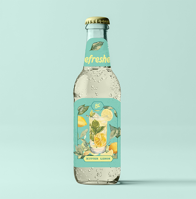
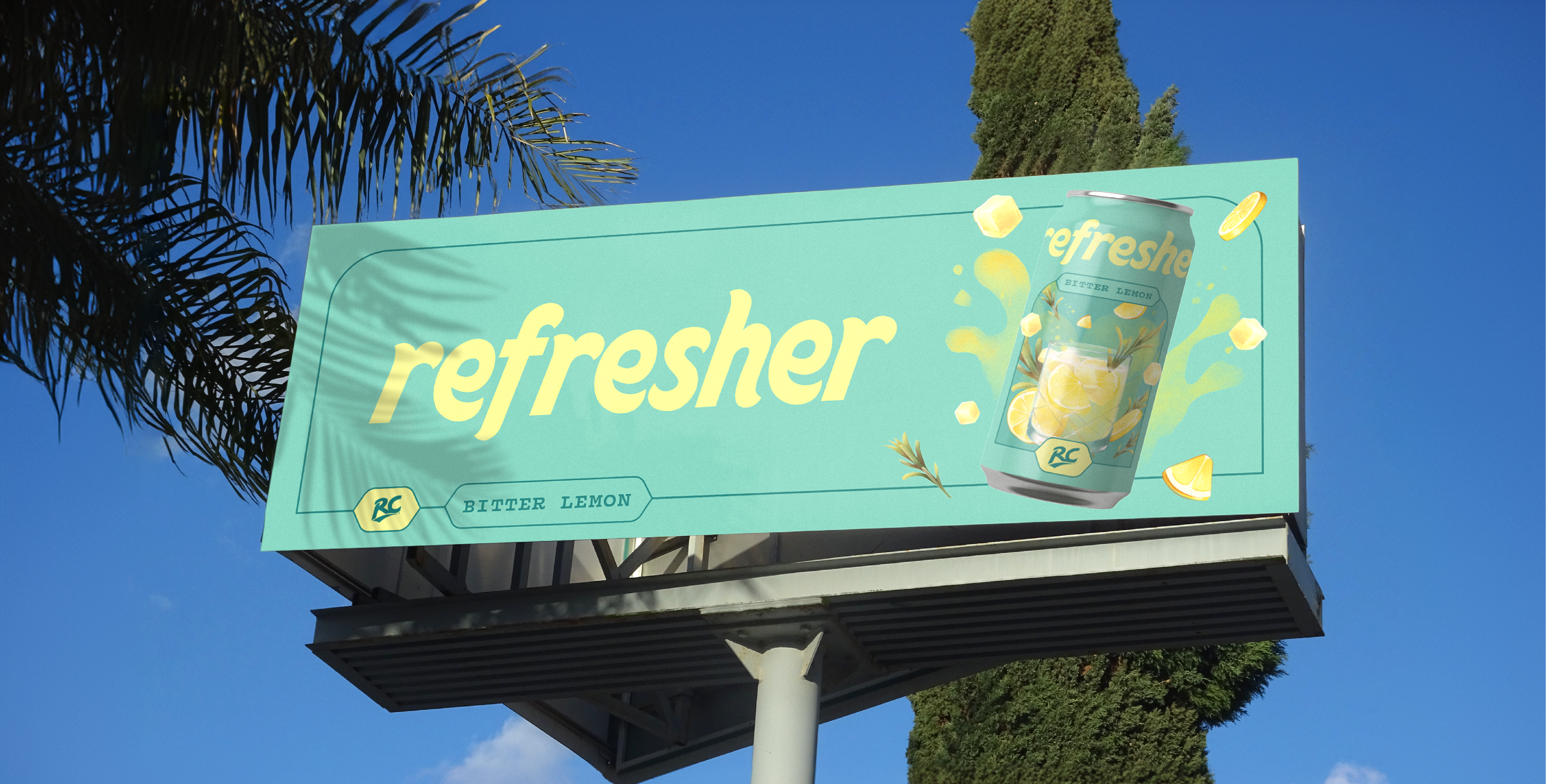
In the saturated world of carbonated beverages, standing out is no small feat. When we started working on Refresher, it was clear that incremental changes wouldn't cut it. The brand needed a complete overhaul - one that would change the perception on the product.


Our strategy? Embrace the past to revolutionize the present.
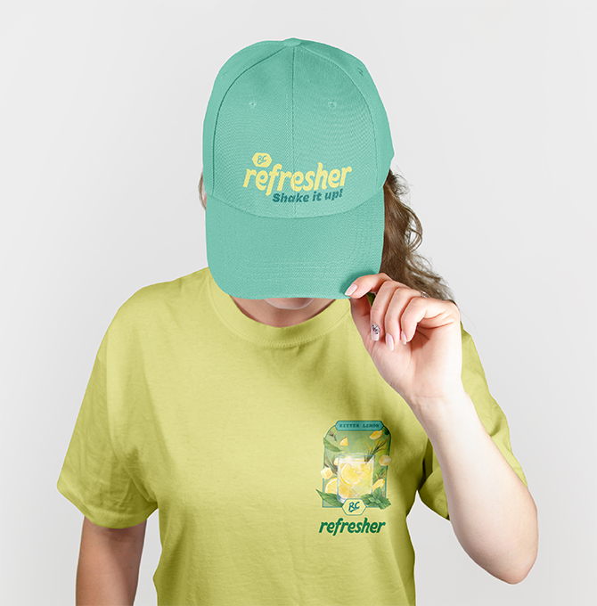
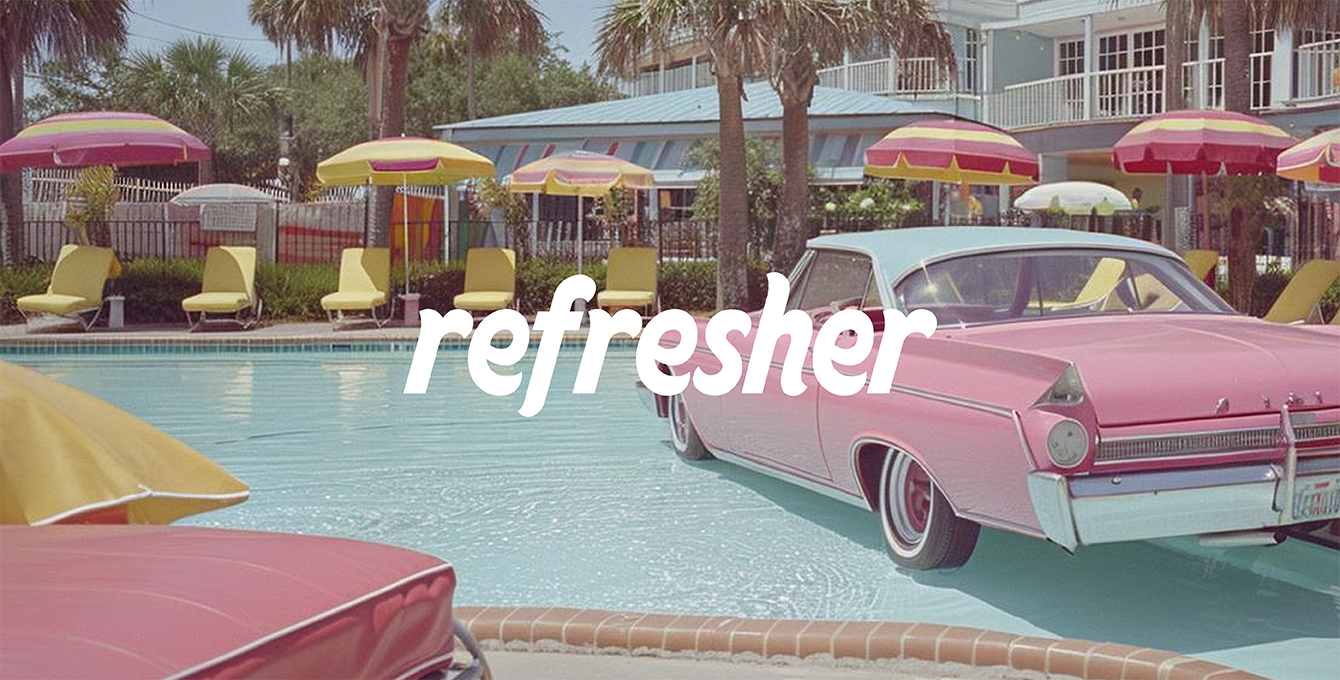
We began with the logotype, crafting a design that pays homage to
vintage aesthetics while delivering a modern punch. The sharp
finishes aren't just for show - they're a visual representation of that
first, crisp sip. It's familiar, yet unmistakably fresh.
We began with the logotype, crafting a design that pays homage to
vintage aesthetics while delivering a modern punch. The sharp
finishes aren't just for show - they're a visual representation of that
first, crisp sip. It's familiar, yet unmistakably fresh.
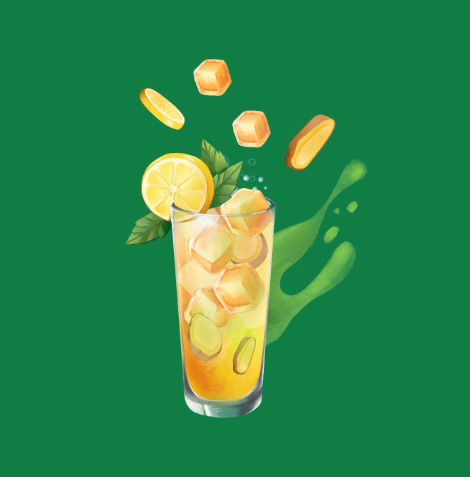
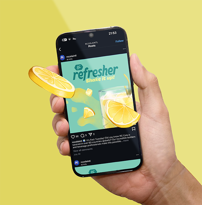
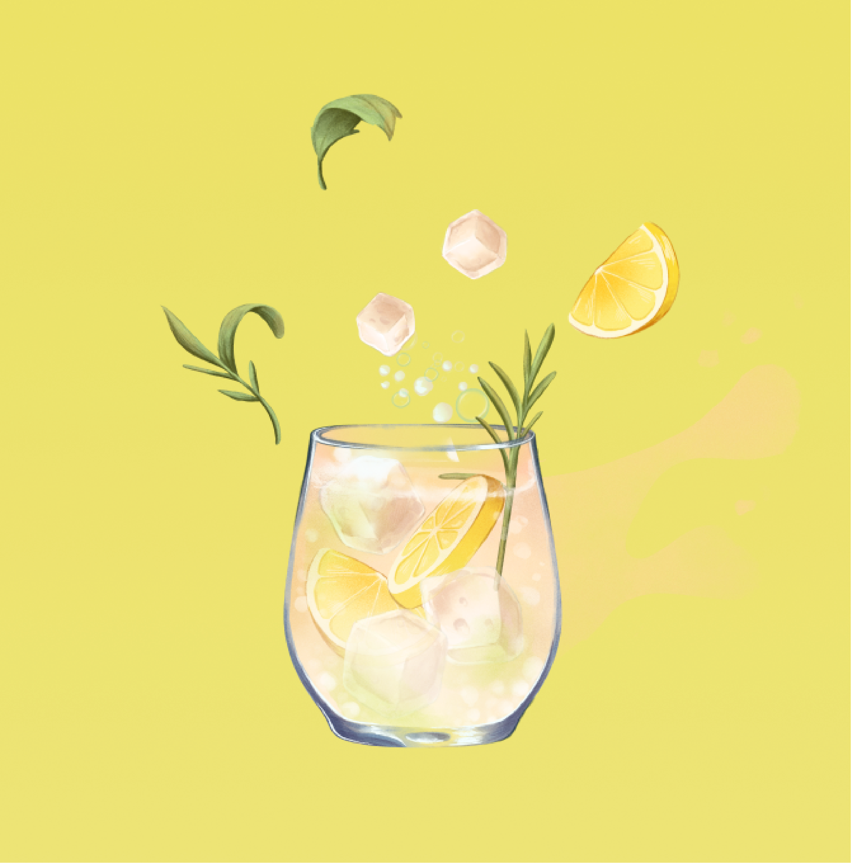
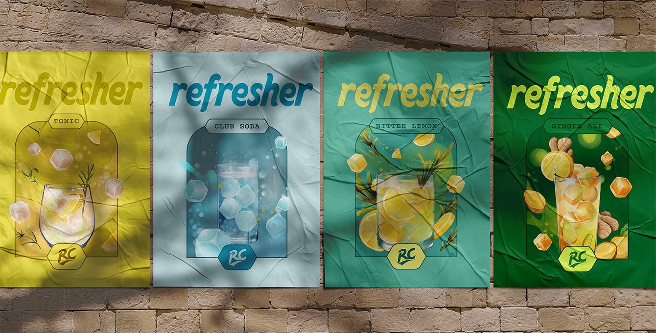
Illustration became our secret weapon. In a market dominated by
sleek, computer-generated graphics, we zigged where others
zagged. Each flavor received its own hand-drawn artwork, adding
a layer of artisanal quality that's rare in mass-market beverages.
These aren't just labels; they're conversation starters.
sleek, computer-generated graphics, we zigged where others
zagged. Each flavor received its own hand-drawn artwork, adding
a layer of artisanal quality that's rare in mass-market beverages.
These aren't just labels; they're conversation starters.

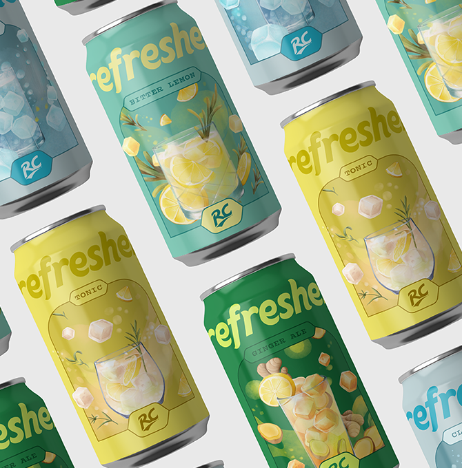
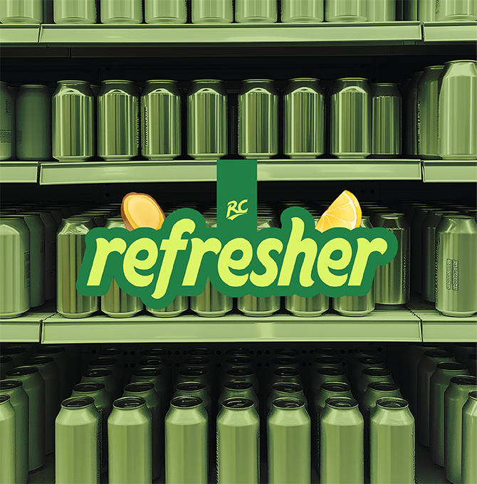
Color played a crucial role in our redesign. We developed a palette that's subtle enough for everyday appeal but vibrant enough to catch the eye. It's a delicate balance - respecting shelf space while refusing to blend in.
The result is a brand transformation that goes beyond surface-level changes. Refresher now stands as a testament to the power of thoughtful design. It's not about following trends; it's about setting them. We've created a visual identity that resonates with consumers seeking authenticity in a market flooded with artifice.

In reimagining Refresher, we haven't just changed how it looks. We've changed how it's perceived, how it feels in hand, and ultimately, how it fits into the lives of consumers who crave something genuine in a world of imitations.
