The Plot
Born from a story of drama
2024
The agency's branding reflects a dramatic, story-driven approach, aligning narrative and strategy. It focuses on drama, pivotal moments, and a storyline unfolding with strategic thinking. The visual language captures this dynamic, emphasising the client’s journey.
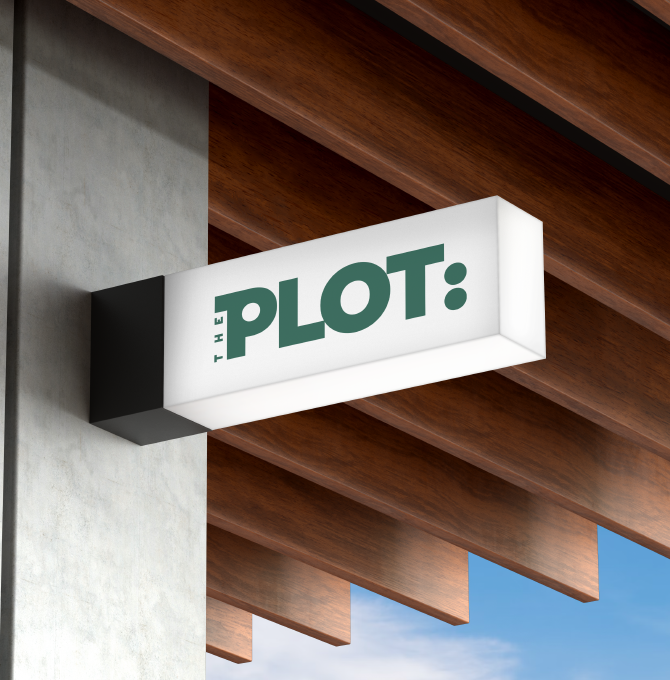
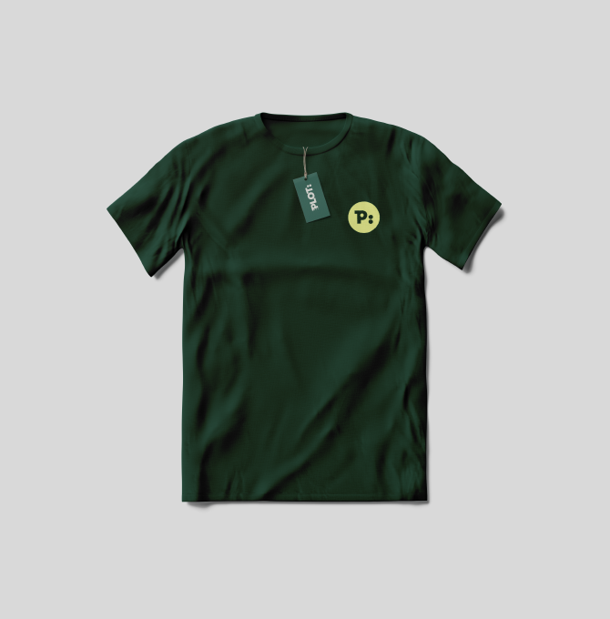
The logo is inspired by two points, symbolising both a fresh start and the two founders of the agency. These points evolve throughout the visual language, representing the beginning of a new story.
Imagery focuses on the simple beauty of everyday moments, highlighting the journey and story behind the brand. It adds an emotional layer to the overall dramatic atmosphere.
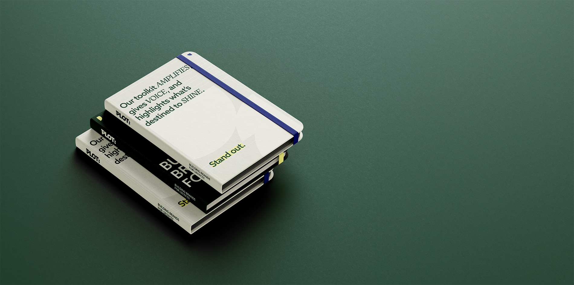
Inspired by Swiss typography, the grid provides structure, representing openness and transparency. It ensures precision, flexibility, and clarity, adapting to different formats while maintaining consistency.
The use of contrasting serif and sans-serif fonts creates a dramatic effect, balancing tradition with modernity. Marker highlights are used to draw attention to key elements.
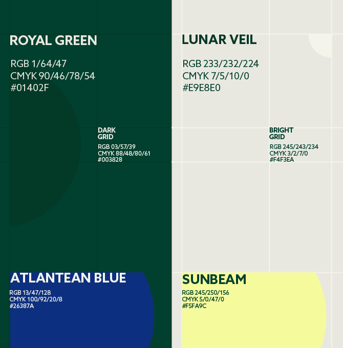
The colour palette brings together deep, rich tones with lighter, brighter accents, reflecting the brand’s balance of drama and openness. Royal Green and Atlantean Blue ground the design, while Lunar Veil and Sunbeam add a sense of warmth and ease.
The colour palette brings together deep, rich tones with lighter, brighter accents, reflecting the brand’s balance of drama and openness. Royal Green and Atlantean Blue ground the design, while Lunar Veil and Sunbeam add a sense of warmth and ease.
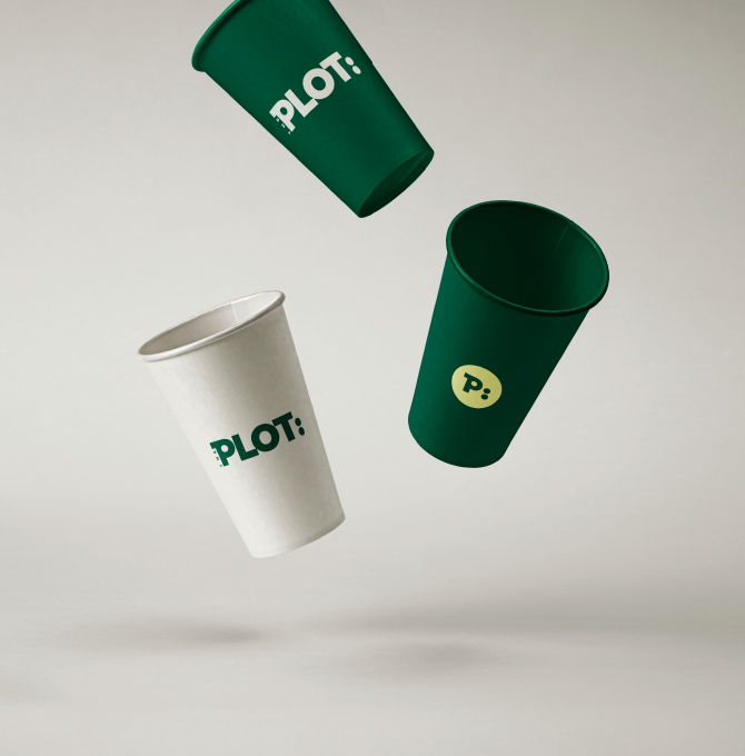
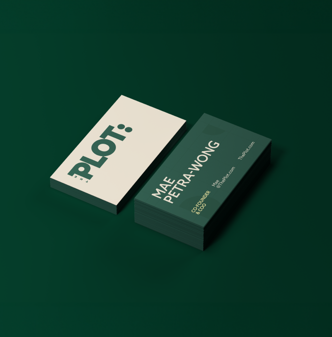
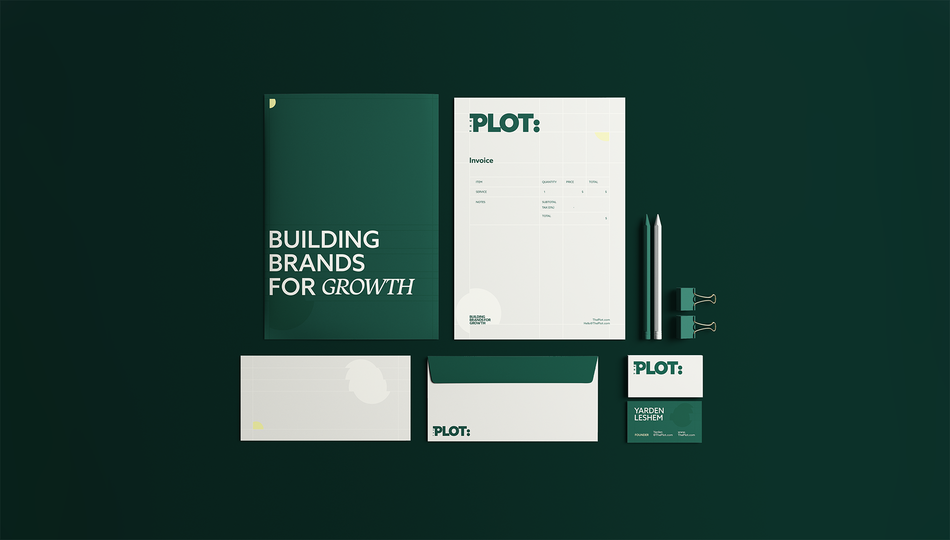
The visual system is applied cohesively across the website, social media, and print, maintaining a unified, yet adaptable brand experience.
